Colour Trends
If you’re ready to refresh the look and feel of your home, you don’t need to go as far as remodelling or updating all of the furniture in your home. Instead, you can focus on adding stylish colours to various parts of your home to give it an entirely new feel.
So, what colours are on-trend for the coming year? We investigated the colour forecasts from paint companies Wattyl and Dulux to get a better idea of what’s to come in 2021. Keep reading to learn about what these companies have designated as the trendiest tones for the new year.
Nourishing hues and neutral tones
In their 2021 colour forecasts, both Wattyl and Dulux referred to the importance of plant-based and “nourishing” earth tones. These naturally energising hues allow us to take a moment to disconnect from our fast-paced, digitally connected lives and reconnect with the people and surroundings around us.
At the same time, the importance of neutral colours was also recognised by both Wattyl and Dulux. Although neutrals seem like they’re simple colours that blend in with anything, there’s also a power behind them that is soothing and draws on natural beauty.
In terms of specific colours, look for deep olive greens, rich mahogany tones, cream-based neutrals, and greenish yellows. These tones blend in nicely with many different styles of home furnishings and other decor, so they’re easy to incorporate into your existing interior design.
Bold and dark colours
On the opposite end of the spectrum, bold and dark colours are also on-trend, according to the experts. These shades create a sense of security in the home, protecting us from the outside world. They’re also a bold and striking design feature that brings a richness to your home design.
Specifically, deep wine reds, dark winter blues, and bold forest greens are predicted to be quite popular next year. For those brave enough, the paint professionals at Wattyl have even projected that black will emerge as a trendy colour as well.
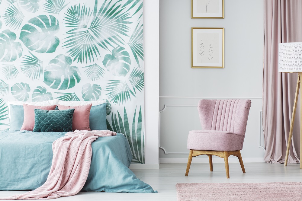
Vibrant but muted pastels
Finally, pastels are projected to be back in style for 2021 — but not in the way that you’re used to. Both Wattyl and Dulux highlighted several shades of muted pastels in their colour forecasts, which can bring a rejuvenated and playful feel to any room. These fun hues are intended to evoke the feeling of rebirth and renewed energy.
The colours in this group include shades such as pale pinks, mint greens, eggshell blues, and light greys. Any of these options would work well as an accent wall or as a pop of colour in furniture, artwork, or decor. By mixing and matching these pale pastels, you can amp up their energising feeling even more.
Not only does a well-designed house enhance your time spent at home, but it can also increase the appeal of your property when you sell your home. With professional property styling from Pabs, you can attract more prospective buyers and boost the sale price of your home. Learn more about Pabs by calling us today on 1800 20 10 20 or visiting our website.