Interior Colour Scheme Ideas Designed to Impress
With a rainbow full of colours at your fingertips, it can be difficult to choose the right palette for the interior of your home. Not only do you have to consider the types of colours that you like, but you also need to consider various other factors about your house, including lighting, layout, and furniture.
In this post, we’ll look at four interior colour scheme ideas to inspire your home style. Whether you’re renovating your existing space or moving into a new one, check out the colour palettes below to find one that works for you.
Calming neutrals
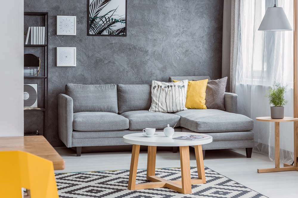
If you’re looking to keep it simple and classic, you can never go wrong with a calming neutral colour scheme. Within this palette, you’ll find lots of comforting and warm hues like cream, taupe, camel, ivory, olive, and grey.
While some people might consider a neutral palette to be dull, it’s a safe bet for any type of room — including bedrooms, kitchens, and lounge rooms. And if it feels too drab, you can always use bright-coloured accent pieces to add a vibrant splash to your space.
Natural earth tones
When you choose earth tones for your interior design, you’ll create a natural and organic feeling in your home. Some of the shades within this scheme overlap with the neutral palette (including the creams and greys), but it also incorporates other colours found in nature, like greens, browns, blues, oranges, and reds.
In design, these sorts of colours create a nurturing and soothing atmosphere. Like neutrals, they are well-suited to all different types of rooms. They’re particularly effective in bathrooms and other areas of your home where you want to relax or feel connected with nature.
Monochromatic scheme
Using a single colour throughout an entire room might sound boring. But when done correctly, monochromatic schemes can look on-trend and sophisticated. The idea is to use varying shades of the same colour, along with small accent pieces in complementary hues.
One of the best things about monochromatic designs is that they can evoke very different feelings, depending on which colours you choose. For example, if you opt for a white or grey monochromatic design, your room will appear muted and toned down. But if you go with a bolder colour like yellow or purple, you can create a vibrant space that’s uniquely yours.
Happy pastels
With a pastel colour palette, you can infuse brightness and positivity throughout your home. When used in parallel with other more subtle shades, pastels like light pink, robin egg blue, mint, lilac, and light yellow will create a colourful, one-of-a-kind look.
However, it’s important to be tasteful when bringing pastels into your interior design. If you use too many bright colours, they could clash, which is often confusing and overwhelming to look at. In general, it’s best to stick with a few pastel-coloured pieces that tie together.
When choosing a colour scheme for your home, be mindful of how it will appear to potential buyers if you ever sell your property. Typically, this means avoiding harsh styles that will drive away the average home viewer.
When you’re ready to put your place on the market, Pabs can help you transform it into an attractive space that brings in potential buyers. Learn more about our company by visiting our website or calling us on 1800 20 10 20.